Owlbear Rodeo 2.0 Dev Log 1
Looking at the new structure of Owlbear Rodeo 2.0

It's been a month since we last talked about Owlbear Rodeo 2.0 and we have some exciting updates to share with you all.
When we first started out on Owlbear Rodeo we had no grand plans or big vision for what the site should be. We just wanted a simple way to play our D&D games online.
Fast forward to now and we've been working on Owlbear Rodeo for a bit over a year and a half and through this process the site has changed drastically. In collaboration with the community new features and concepts have been continually added, we've also had a lot of time to think about what we want Owlbear Rodeo to be.
As we've been continuing the design process for 2.0 it became clear that this is the time to rethink how Owlbear Rodeo works at the atomic level.
We'll go over some of the changes in a bit but the first thing to mention is that in a technical sense 2.0 is a completely fresh start, new code base, new networking, new UI and more.
Ok on to the good stuff.
Games to Rooms
This is a more semantic change but it is something we've wanted to do for a while. In Owlbear Rodeo 1.0 the first thing you do is create a Game in 2.0 you will create a Room instead. The functionality will be similar but the new name better captures what the concept represents.
Maps to Scenes
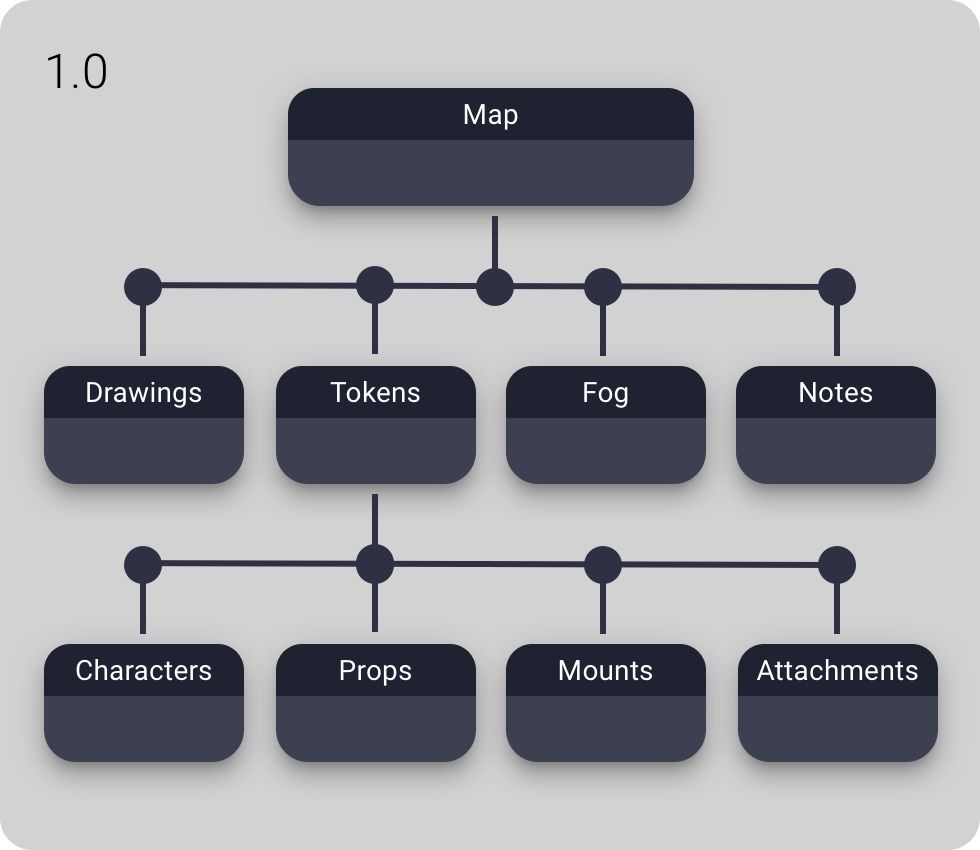
In Owlbear Rodeo 1.0 the base layer of all things you see in a game is a map. The map exists in an empty space but all tokens, drawings, fog etc. are attached to that map. This made sense for us early on because it makes things very simple. In 2.0 we're adding a new layer called a Scene that sits on top of maps and tokens. This allows us to have better support for multiple maps at the expense of a little more complexity.
Below is a comparison of the Owlbear Rodeo 1.0 game structure vs the Owlbear Rodeo 2.0 room structure.


Looking at the new structure you'll also notice the token categories from 1.0 (Characters, Props, Mounts, Attachments) have also moved up the structure and replaced the general Tokens type.
This change allows for a lot more flexibility and allows us to offer deeper integration for things like attachments.
New Attachment Workflow
Speaking of attachments with 2.0 we're looking at reworking the attachment workflow to be more structured and fix a couple of the current issues.
In 1.0 attachments work by adding a small handle at the bottom of the token that acts as the interaction point. This works to prevent accidental interaction with the attachment when you really want to select the token below.
While this works the handle can get a little confusing for odd shaped attachments or when using multiple attachments.
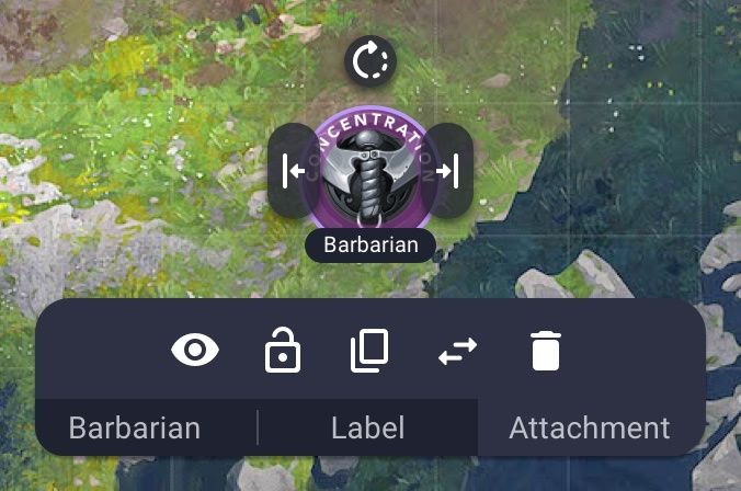
To combat this in 2.0 the attachment handle is gone and instead attachments can be selected through a new tab control available when selecting the underlying token.
Below is an example design of how this menu may look.

Here you can see that the Concentration token has been selected by first selecting the Barbarian token then selecting the Attachment tab.
This new design should scale better to multiple attachments and avoids UI clutter by only showing the attachment options when needed.
What's Next?
We've spent the last month doing a second design pass and completing a bunch of technical spikes to test out some of the new tech that we'll be using for 2.0. In the next coming weeks we are planning to start the build in earnest so stay tuned for more updates.
