Owlbear Rodeo 2.0 Dev Log 2
Discussing some of the core goals of Owlbear Rodeo 2.0

In the first dev log we talked about some of the structural and design changes coming in version 2.0. Today though we'd like to discuss some of the core goals of Owlbear Rodeo 2.0 and show off some progress we've made in the build process.
Awareness
One of the big goals we wish to achieve in 2.0 is to maximise the sense of awareness when using the site. We want each player to feel like they know what everyone else is doing just like at a physical table.
To accomplish this we're aiming for all interaction with the scene to be synced to every player in real-time.
This means token movement, drawing, pointers, rulers, dice and anything else that the user interacts with.
To do this we've created a new real-time sync engine and are happy to show some of the results from the current build of the site.
Below is an example of dragging a token in Owlbear Rodeo 2.0. The user on the left grabs and moves the token, the user on the right sees this movement in real-time and also sees who is performing the movement with the name-tag above the token.
This real-time engine can also be expanded to support an often requested feature from 1.0, view syncing.
In the GIF below the user on the left has enabled view syncing so when they move their viewport the user on the right automatically syncs with them.
Streamline Common Actions
The next goal we have with 2.0 is to remove some of the friction of common actions in the UI.
The first effort in this can be seen with the new scene menu which is being pulled out from behind two dialogs and is now a single button click away.
Below is the new scene menu which allows you to adjust the scene grid with ease in real-time.

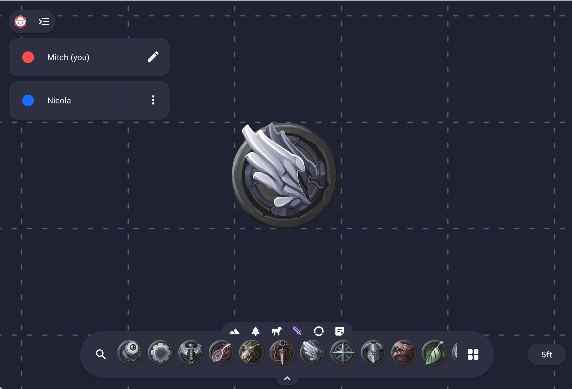
The next thing we'd like to show is the new dock which replaces the old token bar.
The first thing to notice is it's now horizontal instead of vertical.
This change allows us more room for controls like new tabs at the top of the dock that allow you to easily filter for the types of items you want.
Or the new search function which has made its way to the main screen instead of being behind a dialog.
Below is an example of using the new search function through a shortcut to streamline the process of adding a new item from the dock.

What's Next?
We've been hard at work over the last month building the underlying systems for 2.0. For the next month we'll be focusing on reimplementing the features of 1.0 to make use of these new systems. There's a lot to do so stay tuned for more updates!
