Owlbear Rodeo 2.0 Dev Log 5
Looking at the new selection, attachment and text systems.

For this month's Owlbear Rodeo 2.0 update we will have a look at the new selection, attachment and text systems.
Select Tool
Before we get into the big changes I wanted to share the new multi-selection tool.
It works very similarly to Owlbear Rodeo 1.0 but adds editing controls like rotation and scale that can be done on a selection without the need to create an attachment.
Attachments
Owlbear Rodeo 2.0 features a completely new attachment workflow.
In 1.0 attachments are handled by converting the token to an attachment then the system attempts to magically work by locking the attachment to any token that is underneath as it moves.
In 2.0 attachments are created manually by the user by selecting the item and then linking it to any other item.
This workflow has a few benefits:
First any item can now be attached to any other item, this means that images can be attached to other images but also drawings, fog and text can also be used as attachments.
Second attachments are no longer limited to being attached to the items center, this is great if you want to attach a line spell as you no longer need to have empty space in the image to trick the system into getting the right attachment point.
Below is a GIF of this in action, the status effect is selected then the Attach tool is used to create a tether between it and the character.
Now that the status effect is attached to the character it will follow its movements, rotation and scale. The attached token can also be moved independently by selecting it instead of the character.
As mentioned this isn't limited to only images, below is an example of attaching a drawing to an image.
For those familiar with the attachment system of Owlbear Rodeo 1.0 when a token is marked as an attachment it can no longer be selected by clicking the image and instead a small handle is created to allow you to select it.
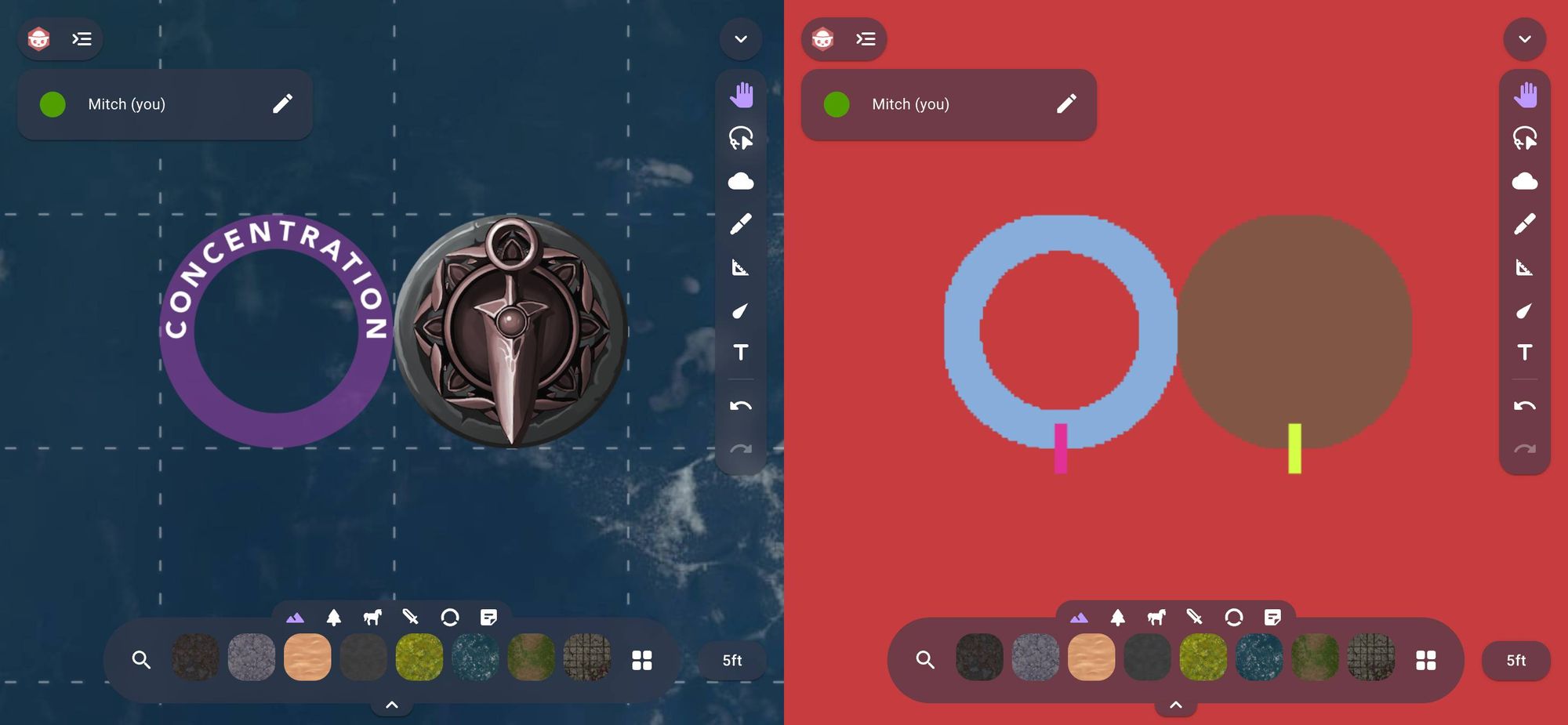
This has been removed in 2.0 as we have a new image selection system that is pixel accurate. As an example we can select the character underneath the status effect as it has a transparent center. This removes the need for the selection handle.
To show this a little clearer here is a side by side of the same scene with the normal view on the left and the hit detection debug view on the right. The red is the background map, the blue is the status effect and the brown is the character. Notice how the status effect has a transparent center which matches the original image.

Ultimately the new attachment workflow is a lot more flexible, it can also be combined with the selection tool to replace the mount system from 1.0 as you can select a group of characters and attach them to the mount in a single action.
Text

A lot of effort has gone into a completely new text system for 2.0, our main goals with this new design were to increase the flexibility of the system while also making it more intuitive to use.
To accomplish this we have to go over a few things.
First, all text is now entered directly onto the canvas. This means that we've removed all the popups that allowed you to enter text and now you can enter text just as it will be seen when you're done editing.
Next, we have a new text tool that replaces the note tool in 1.0. The text tool's default behavior allows you to select anywhere on the map and start entering text. This text can then be moved, locked, hidden and attached like any other item.
The text tool also allows you to select any text that is on the map and start editing it right away, this is the case for raw text items but also token labels and notes.
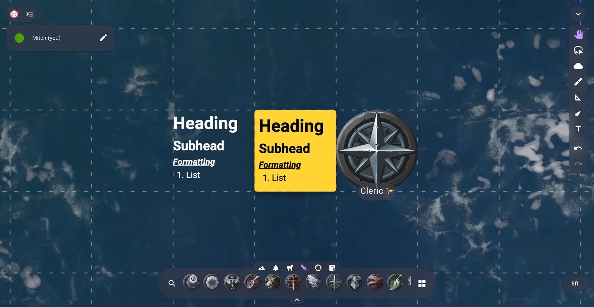
This text tool also supports rich text, this means that you can add headings, subheadings, lists and more. Below is a GIF of this in action.
Keen eyed observers might also notice that in the above GIF we also support traditional markdown shortcuts for formatting.
The next big change is for notes.
Notes are now a new type of image instead of a separate tool. This has a few benefits but the main one is you can now provide your own custom backgrounds for a note. By default we provide the various coloured sticky notes but with this system you could potentially add notes that fit into your world or even use a note for an editable handout.
Notes also support rich text so you can add headings and lists.
The last text option is for image labels.
We wanted to keep the same simple design from Owlbear Rodeo 1.0 but allow for a bit more flexibility.
Labels now support multiline text, coloring and we also have a new in-built emoji picker that allows you to add emojis without the need to use the system emoji keyboard.
Labels, text and notes can also all be edited quickly by simply double clicking on them in the viewport.
Below is a GIF of the new note and label options in action.
What's Next?
With this we have now re-created all the tools available from 1.0 in 2.0. We still have a lot more work ahead of us but this is a big milestone for us.
Over the next month we will be looking at things like permissions and persistence so stay tuned.
