Owlbear Rodeo 2.1 Release Notes
Owlbear Rodeo 2.1 is here and with it comes some great usability enhancements, a new delightful home page and more.
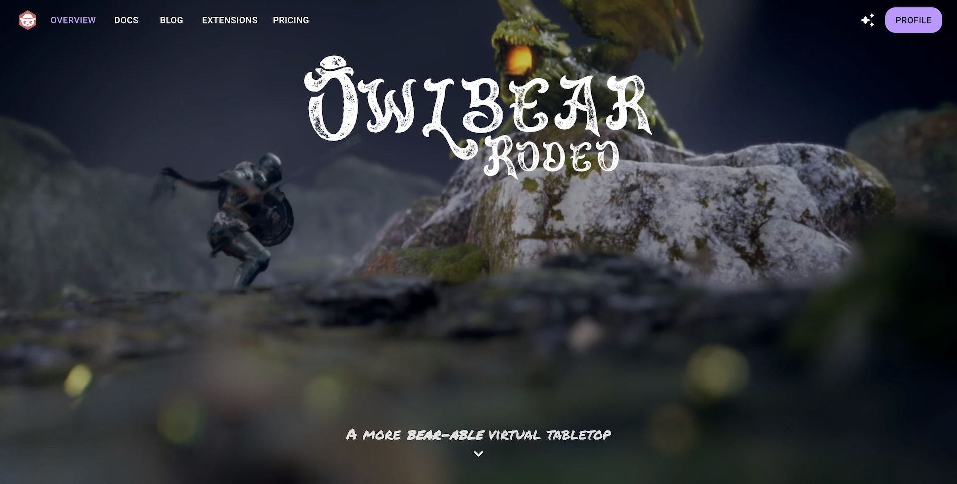
New Home Page
To spice things up we've added a new visual design to the Owlbear Rodeo homepage. The background features a scene of a knight facing off against a green dragon. As you scroll the Owlbear Rodeo interface fades in and the camera moves to show a top-down view of the scene.
A new cinematic homepage transition
I originally built this scene for my players a few years ago for a D&D campaign I was running so it's great to be able to use it for the OBR home page.
The animation was made in Unreal Engine and uses a simulated tilt-shift lens which I think adds to the "tabletop" feeling.
If you're not seeing the animation then make sure you turn off any Reduce Motion settings as we don't play the animation when they are enabled.
Streamlined New User Experience
Owlbear Rodeo has always been known for being extremely quick to get started with. A large part of this in 1.0 were the default tokens and maps that were available. In 2.0 we expanded this with the addition of Starter Sets that provided default tokens, maps, status rings and more. To improve this workflow even further in 2.1 we're streamlining how users get access to these Starter Sets.
Before when adding a starter set you would need to scroll down on your user profile and click each one you wanted. This workflow caused some friction when creating your first room; it could also be easily skipped by new users.
To fix this issue (and a few more we'll discuss below) 2.1 brings with an all new asset creation experience.
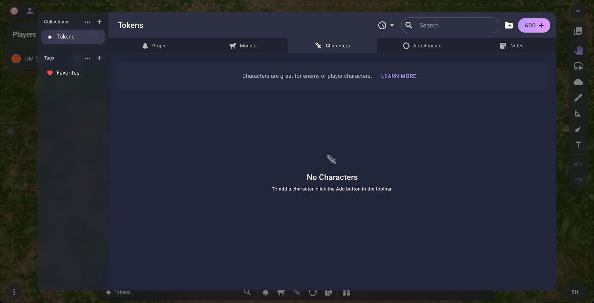
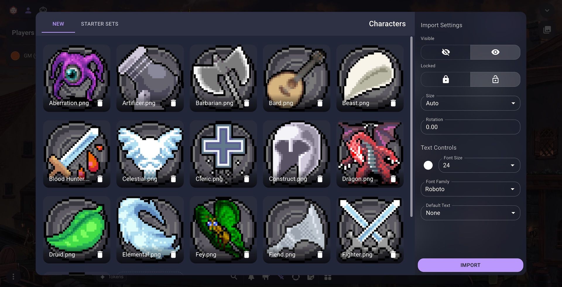
Within the new Token Manager you can add a new token by clicking the Add button in the toolbar. When you do this you'll be met with the new Token Importer. The Token Importer is split into two tabs New and Starter Sets. In the New tab you can import multiple tokens at once. There's also some great new options which give you fine grained control over how those tokens will be imported. For example with the new text import controls you can ensure all your imported tokens use the same font or text color without needing to edit each one individually.
In the Starter Sets tab you'll have access to all the Starter Sets available for the current type of token you're importing. For example when adding a new character you'll be shown the Characters and Monsters Starter Set provided by us. Once you've clicked on this set you can either add all the tokens into your library or pick and choose which tokens to add.
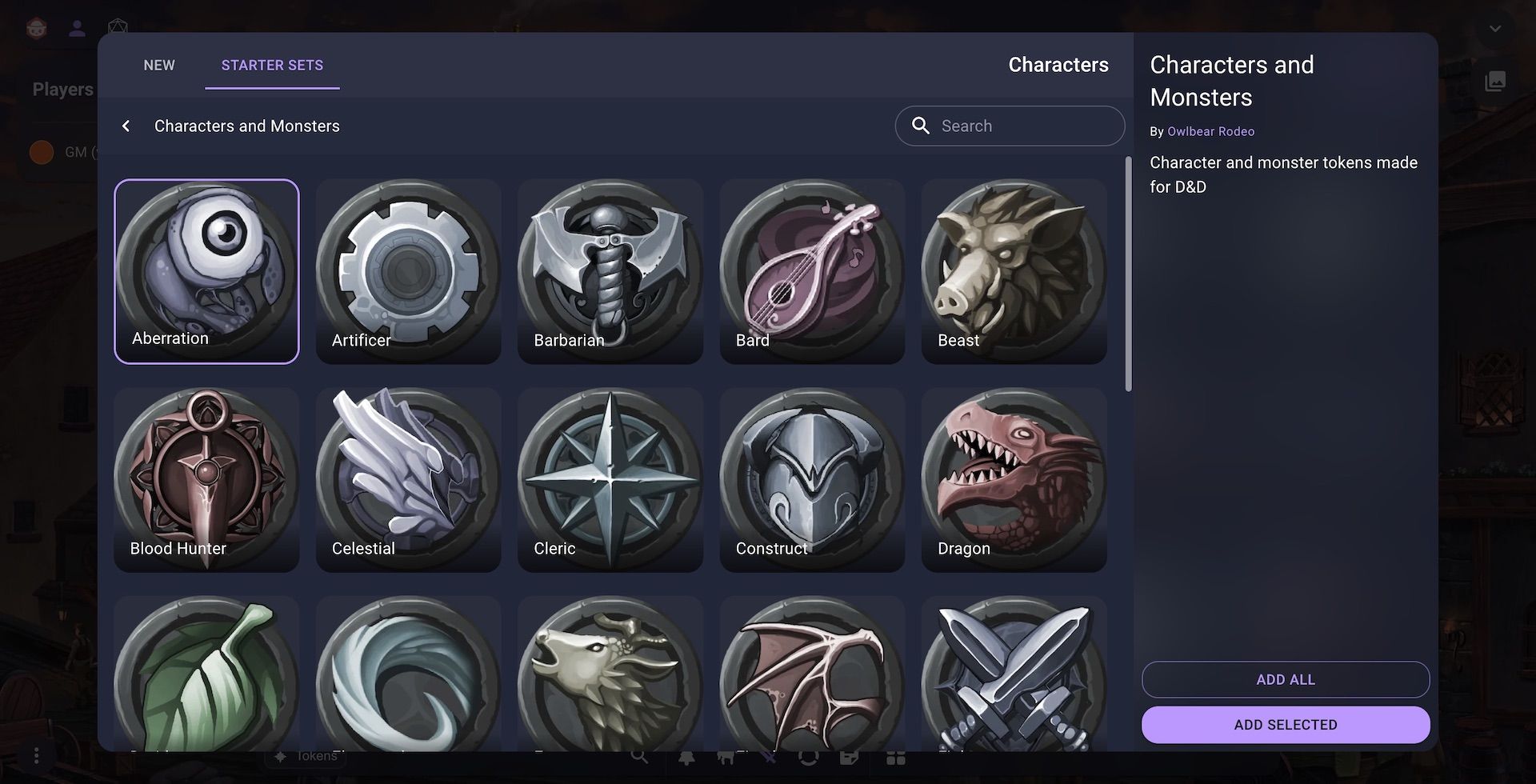
This workflow has a more natural user flow compared to the old method of jumping back and forth between the user profile and asset manager to get access to the Starter Sets.
Scenes, Maps and the Atlas
Those of you who are pedantic like me or possibly just obsessive about the Owlbear Rodeo UI (also like me) may have noticed that the Token Manager shown above has changed its name. You may also notice that there is no longer a tab to manage your maps. These two things are linked and are because of the change I'll detail below. When 2.0 launched the dock at the bottom of the page allowed you access all of your images. This included characters and other token-like things but it also showed you all your maps. Because of this we called it the Image Manager.
In 2.1 we've removed the maps from the Image Manager and changed its name to the Token Manager because it now only shows you your token-like images.
Going forward to get access to your maps you can open the Atlas. The Atlas combines all your scenes and maps in one place.
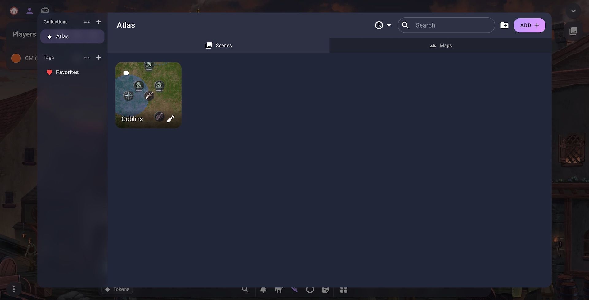
The Atlas is split into two tabs, Scenes and Maps, which allow you to manage your scenes and maps respectively. We made this change because there has always been a bit more of a link between scenes and maps compared to the other image types and we think this change better conveys that.
Like the new Token Importer 2.1 brings with it a new Scene Importer. You can access it by clicking the Add button in the toolbar while the Scenes tab is selected. Once in the Scene Importer you can easily create a new scene from the New tab.
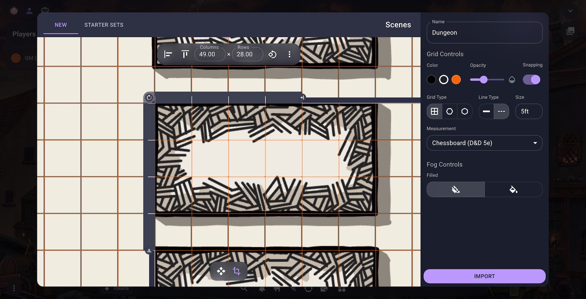
The new flow for importing a scene and map has been streamlined in a few ways. First the grid controls are now always visible in a new sidebar. This should make it quicker to adjust the grid instead of jumping in and out of a popup menu. To make it easier to align the map to the grid we've also redesigned the grid alignment tool. Instead of a single popup menu we've brought the most common controls out into a new bar that sits on top of the viewport. To make using the alignment rulers easier we've also made it so when you switch to the alignment tool the grid lines will automatically show in a highlighted color to make it easier to check your work.
As with the Token Importer you also have access to a bunch of Starter Sets for your scenes.
Easier Extensions Installation
Continuing the theme of streamlining the user experience in 2.1 you can now install extensions directly from the main Owlbear Rodeo interface.
This can be done from your user profile by clicking the Add button in the extension section. It can also now be done directly inside a room by clicking the new Add button when managing your extensions.
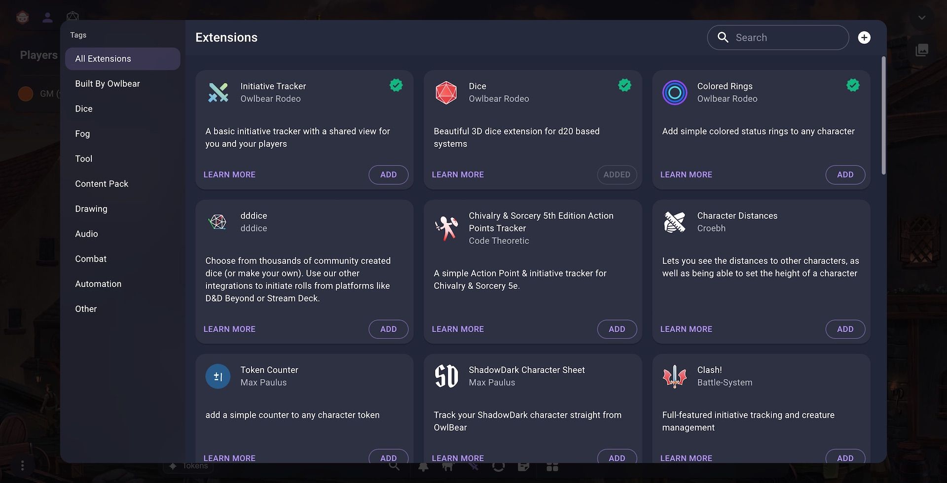
We think that this change will greatly simplify the extension process for new users.
Extendable Context Menu
As more extensions are created we've noticed that we need a better way to manage all the buttons that are added to the context menu. There's also been a common pattern that has emerged where an extension provides custom controls to adjust a token. For example the colored rings extension which provides a grid of colored buttons that can add a ring to a token. To make this use case better we want to provide quicker and easier access to these types of controls.
Below is the new menu bar that is shown when you select an item in a scene. The bar has been simplified with the name field being removed. Instead the name can now be found in an accessibility menu option which is detailed in the next section. We made this change due to feedback from users that the name field was causing unwanted spoilers for players.
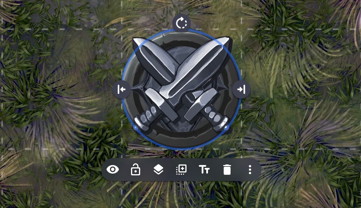
The new context menu bar will only show the most common actions up front with less common actions or actions added by extensions being moved to an overflow menu.
This fixes the issue with an infinitely growing context menu bar with dozens of icons. Adding a sub-menu has the possibility of making the experience worse because what was one click might turn into two. This issue would be further felt with the extensions mentioned above that add their own popup menu. To fix this sub-sub-menu issue extensions can now add their own custom controls directly to the menu itself instead of needing to open their own popup.
Below you can see this with the colored rings extension which adds its colored circles directly to the overflow menu.
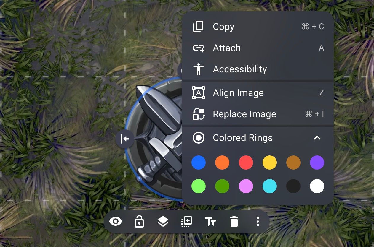
With this change extensions like colored rings should have the same ease of use as the previous menu design. But we didn't want to just have the same usability, we wanted to improve it. So to make it even easier you can now directly access the overflow menu by right clicking on an item. This skips the menu bar and makes it easier than ever to access your favorite extensions.
Below we show how it is a lot quicker to now use the colored rings extension.
Quick access to the overflow menu
Accessibility
Our goal has always been to make Owlbear Rodeo the most accessible VTT. For a long time this has meant trying to make the platform as easy to use and learn as possible. It also meant we wanted the site to work across many types of devices (desktop, tablet, mobile). In 2.1 we're taking the first steps to expand these principles in a few key ways. First is a greater focus on keyboard accessibility. Second is broader support for screen readers.
Keyboard accessibility is critically important for those who are unable to use precision pointing devices like a mouse or touchscreen. In 2.1 you can now use the Tab, Enter and Arrow keys to interact with tokens drawings and more.
Below these new features are demonstrated by using the Tab key to find and select the Fighter token then using the Enter key to open the context menu and activate the hide button. Then the search shortcut is used and the Tab, Enter and Arrow keys are used to pick up a token from the search results and drag it into the scene.
New keyboard controls
Screen readers are vitally important for those with low or no vision. In 2.1 we now expose the contents of a scene to the screen reader so those who rely on this technology can have a better experience. To help GMs who have players with these requirements we also now offer better ways to add textual descriptions to tokens, maps and more.
You can find the new accessibility settings in the new context menu.
Once open you can add a GM only name field or add a description that will be read when using a screen reader.
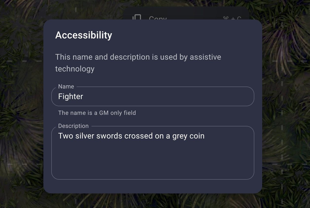
These two changes are the first steps to making Owlbear Rodeo truly accessible to everyone. But I want to recognise that there is still a LOT of work to do before that vision is fully realized.
Other Changes
Current scene notification
We've added a little notification at the bottom of the Atlas showing which scene is currently open.

The Find button on the left side will allow you jump straight to the folder that has that scene and the Close button right will close the scene.
Map insert button
Since maps are now in the Atlas instead of the Dock to add a map to a scene we now show an Insert button on the map tile.
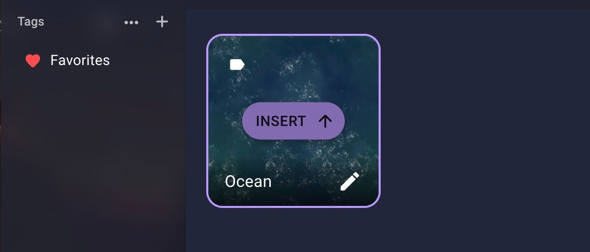
You can also still drag and drop from the Atlas into the scene to insert a map as well.
More visible folder button
Since we have a new Add button in the Atlas and Token Manager the New Folder button has been given its own button in the toolbar.

This should also have the added benefit of making folders easier to create and find for new users.
Better asset tile names
You can now hover over the name shown on an tile to see the full name.
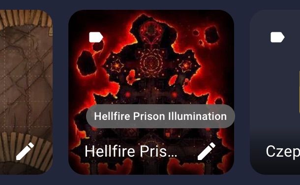
This will be great when you have two images with very close names and need to tell which is which.
More context menu items
With the new context menu we've added a few new default options and changed the names of a few options to better represent their function.
The previous Edit option has been renamed to Align Image for images and Edit Curve for curves, Edit Rectangle for rectangles and so on. This should make it easier to tell what the option means.
We've added a new Duplicate option in the default context menu. This acts the same as the previous Alt+Drag shortcut but will now work for devices without a keyboard.
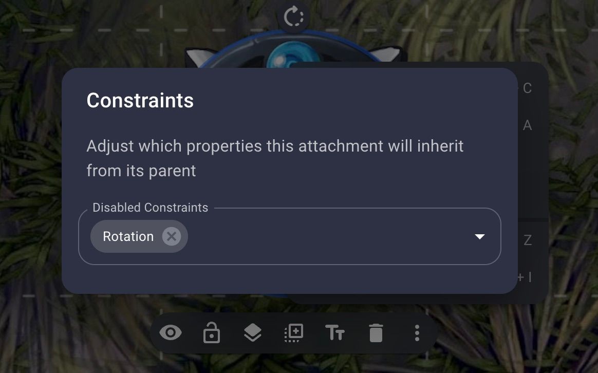
Items that have been attached to another item will now have a Constraints option. This will allow you to adjust which properties are affected for this attachment.
Better copy and paste
Copy/paste will now try to use the system clipboard if the browser allows access to it. This means you can now copy and paste between rooms. You can also now paste an image directly into a room and it will upload and place it into your scene for you.
Faster image drag and drop
When dragging an image from your computer directly into a scene the local version of the image will now be shown while the image uploads to your account. This makes it a lot quicker before you can start interacting with dropped images.
Automatic grid color for scenes
When importing a new map and scene together the default grid color will be chosen from the brightness of the map. For example a bright map will use a dark grid and a dark map will use a light grid.
What's New Badge
When signed in, a badge will now appear next to the Profile button on the homepage or in the Extras Menu in a room. Clicking this will open a dialog with a shortened version of the release notes for those who don't follow along with this blog.
What's Next
It's been five months since Owlbear Rodeo 2.0 launched and we've gotten so much great feedback. With 2.1 we've incorporated a lot of the feedback around asset management, the new user experience and general usability but we've still got a lot of big updates planned for this year and beyond.
In the near term we hope to spend the next few weeks updating our documentation with better examples and making sure everything is up to date for 2.1.
So stay tuned for more as we continue to build Owlbear Rodeo to be the best it can be.
