Owlbear Rodeo 2.2 Release Notes
Owlbear Rodeo 2.2 is out with further improvements to the asset workflow, new starter sets, new extensions and more.
Owlbear Rodeo 2.2 is out with further improvements to the asset workflow, new starter sets, new extensions and more.
Combined Asset Manager
Ever since the start of Owlbear Rodeo there have been two places to view your assets. In 1.0 there was the map and token manager, in 2.0 there was the scene and image manager and in 2.1 there was the Atlas and token manager.
In 2.2 we are combining these two places into one in the hope to make the site more flexible and easier to learn.
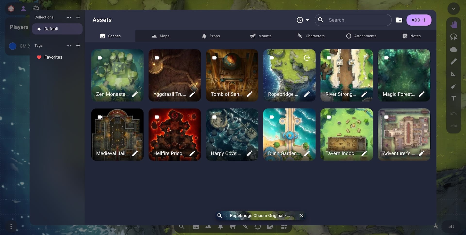
In 2.2 all assets will be available from the dock at the bottom of the screen. This includes scenes, maps and all the token types. This means that any asset can be dragged into the viewport from the dock. When dragging an image it will be added to the current scene but dragging a scene into the viewport will switch to that scene.
In order to add new assets or manage existing assets you can open the Asset Manager using the Asset Manager button on the right of the dock.

This new Asset Manager has a tab for each asset type and acts as a combination of the Atlas and token manager from v2.1.
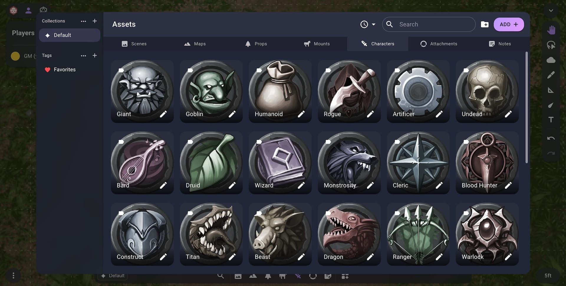
For some of you this will be a big change in muscle memory as the button to change the scene/map has been in the top right of the Owlbear Rodeo UI for almost four years now. But we think this change will make the interface less confusing by having a single place to manage collections, tags and assets. Having all assets available on the dock also means it is easier to change scenes and add maps/tokens to existing scenes.
In order to support these extra tabs we have completely redesigned the mobile dock interface.
The new mobile dock has been simplified with two states instead of three, it has been slimmed down to take up less vertical space and has some nice new gestures that make it easier to use.
In the default state the mobile dock is now a slim bar at the bottom of the screen. When you want to add assets from the dock you can swipe up to expand it then add your assets and swipe it back down to shrink it.
Mobile Dock
Now that all the assets are together the search feature will show you assets of every type. To make it easier to ensure you're selecting the correct asset we now show the asset type on each thumbnail when you're using the search feature.

New Starter Sets from Czepeku
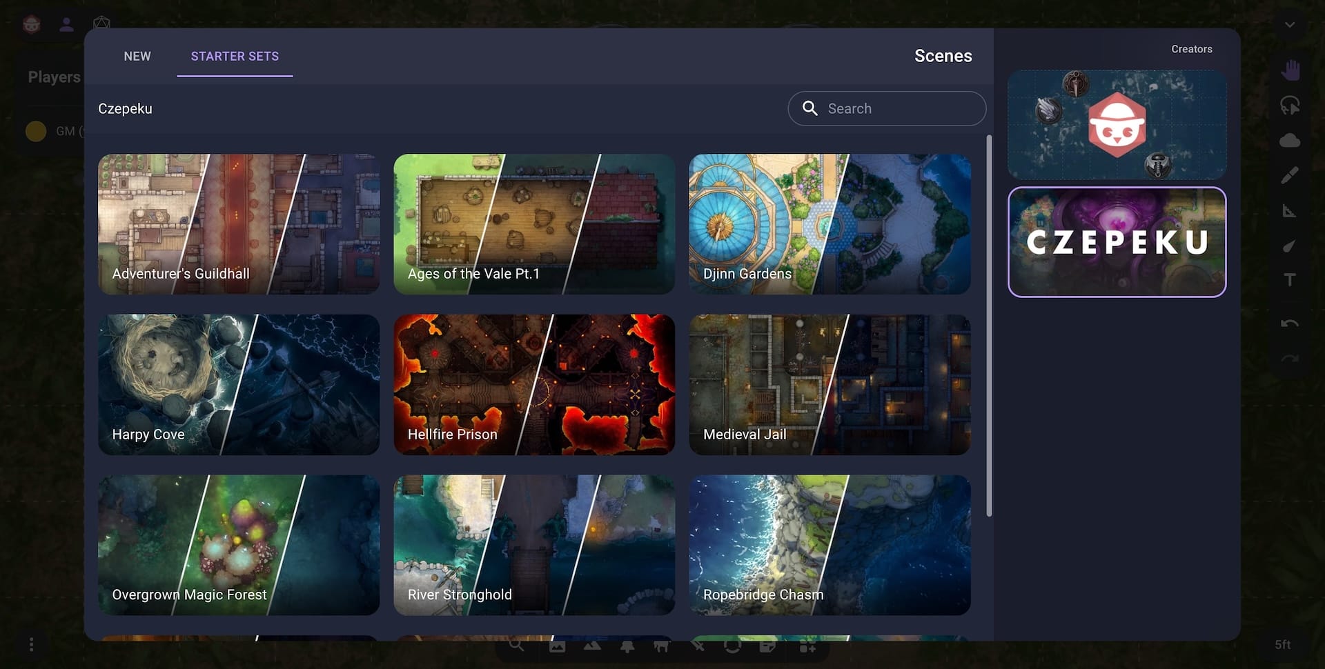
We now have our first third-party Starter Sets with a set of 12 maps (and many more variations) from Czepeku. You can access these maps in the Starter Sets section when creating a new scene or map. Czepeku were kind enough to supply these maps free to all Owlbear Rodeo users so make sure to support them if you like their work. You can do this by visiting their Patreon directly or by clicking the Support Creator button in the Starter Set description.
Outliner
Owlbear Rodeo's layering system is designed to take most of the busy work out of playing on a VTT but when creating more complex scenes you may want more manual control. For those cases we have created the Outliner extension that gives you manual control of the layering of each item.
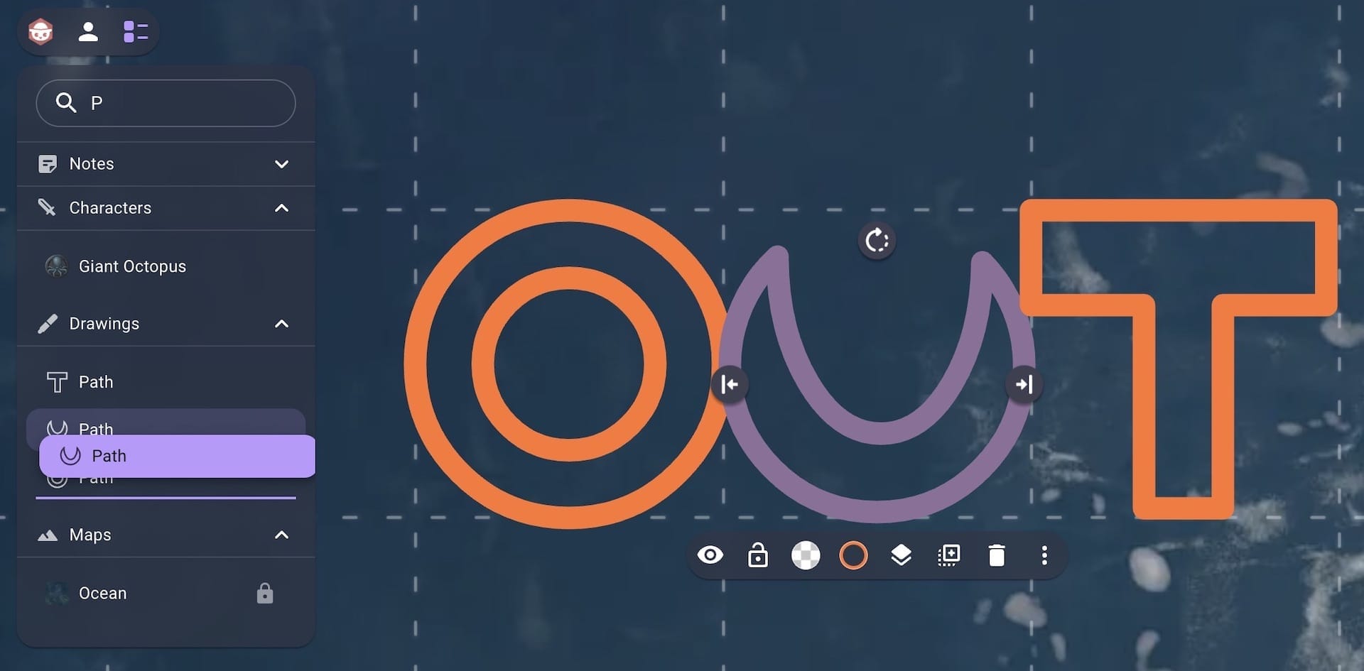
Players will also be able to use the Outliner so if there's anything you don't want them to see make sure you hide it.
Prefabs
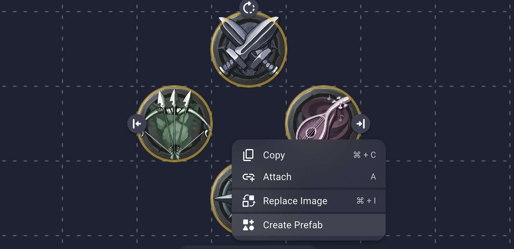
Some extensions modify your tokens by adding labels, conditions, trackers and more. However since these changes are saved to your scene you need to redo this work every time you add your tokens to a new scene. To solve this we created a Prefabs extension that allows you to save your commonly used items as a prefab that can be inserted back into new scenes with all their setup already done.
Import Wheel
One way to import images is to drag them from your computer directly into an open scene. Before this update the type of image that would be uploaded would match the active tab in the dock. We found this behavior could be confusing to new players as it wasn't obvious this was the case (especially if the dock was minimized).
To fix this there is now a selection wheel that allows you to choose which type of image to import when dragging into a scene.
Once you've selected an image type by hovering over the correct icon you can release your mouse to begin uploading. If you would like to import an image to a specific position in the scene you can hold down the Shift key when dragging to lock your selection.
Image Import Wheel
Fog Quick Selection Brush
When running a fog encounter you will often want to select fog shapes to cut/uncut them as your players progress.
Since the launch of 2.0 this could be done by selecting each shape using the Grab tool.
To reduce the number of options and complexity for a new user the Grab tool combines a move and multiselect tool in one.
When dragging on an empty area you are given a marquee to highlight multiple shapes at once. However when you drag a shape that already exists it will move that shape.
Moving fog shapes can be really helpful when you have common structures in your map as you can create one fog shape and then duplicate it across the map.
However, when running an encounter that already has fog cutouts moving fog shapes can get in the way.
The Quick Selection brush is designed to solve this by allowing you to select fog shapes by dragging over them.
You can then use the context menu to cut/uncut the selected shapes.
Since cutting/uncutting shapes is something that will be done very often when running an encounter the Quick Selection brush will turn into a Quick Cut/Uncut brush if you hold down the Alt/Option key when making a selection.
Fog Quick Select and Quick Cut
When cutting out maps the single layer feature of OBR makes it super quick to build complicated shapes out of simple rectangles and circles. You will often want to take these individual shapes and join them into one piece using the Join option. To make this easier the Quick Selection will turn into a Quick Join brush when you hold down the Shift key.
Fog Quick Join
Although this adds a new option to an already complicated part of the software we think that the utility of this tool will make using fog a lot quicker when both running and preparing an encounter.
Other Changes
DPI support for automatic grid detection
The automatic grid detection from filenames will now look for a listed DPI value. For example "Ocean 150DPI.jpg" will be imported at 150DPI.
New size preview in the image importer
When importing images into the Asset Manager each image will now show what size it will import as.
New scene loading animation
There is now a more satisfying loading animation for scenes. The scene loading overlay will now also be behind the regular UI so you can interact with the site when a scene is loading.
Scene Loading Animation
Better number inputs
Text fields that expect a number have been enhanced with keyboard shortcuts (arrow keys will now increase/decrease the value) and better validation.
Smarter initial state for the dock
Previously the dock would always start in the expanded state, this was to show to a new user where the tokens were located. Now that scenes have moved to the dock it will only start expanded if there is no scene loaded. This allows the UI to coach new users but become less annoying to experienced users.
New Realtime Network
We've moved to a new tech stack for our realtime connections. This includes things like party lists, item interaction and more. This is the first part of a big network migration we'll be performing over the coming months so we'll be keeping a close eye on how this goes.
What's Next
In January we made our first hire with our new Community Manager, Andrew. So expect to see more great content from him in the future. Along with the network changes mentioned above we also have many features and performance improvements planned for the first half of the year.
