Towards Owlbear Rodeo 2.0
First look at Owlbear Rodeo 2.0

Hey everyone, we've got a few bits of exciting news to share with you all.
The first of which is that Nicola is now working full time on Owlbear Rodeo!
This is something we've been hoping to do for a while now but it took a bit of planning and saving to make sure we were financially stable enough to give it a go.
This wouldn't be possible without all you Patrons so thank you very, very much for giving us this opportunity.
With this change we hope we can now bring about the big improvements to Owlbear's back-end that we've always wanted to but never had the time.
Specifically we currently have our sights set on a complete server overhaul that should bring better scalability, lower latency and a few more goodies that we hope to discuss soon.
Speaking of big changes, one of our most requested features to date has been adding the ability to see all the player's dice rolls visually.
This is something we've wanted to do from the start but we've known that it would require a big redesign to do it justice.
Well we've finally started on that journey and we're happy to show you some initial designs.
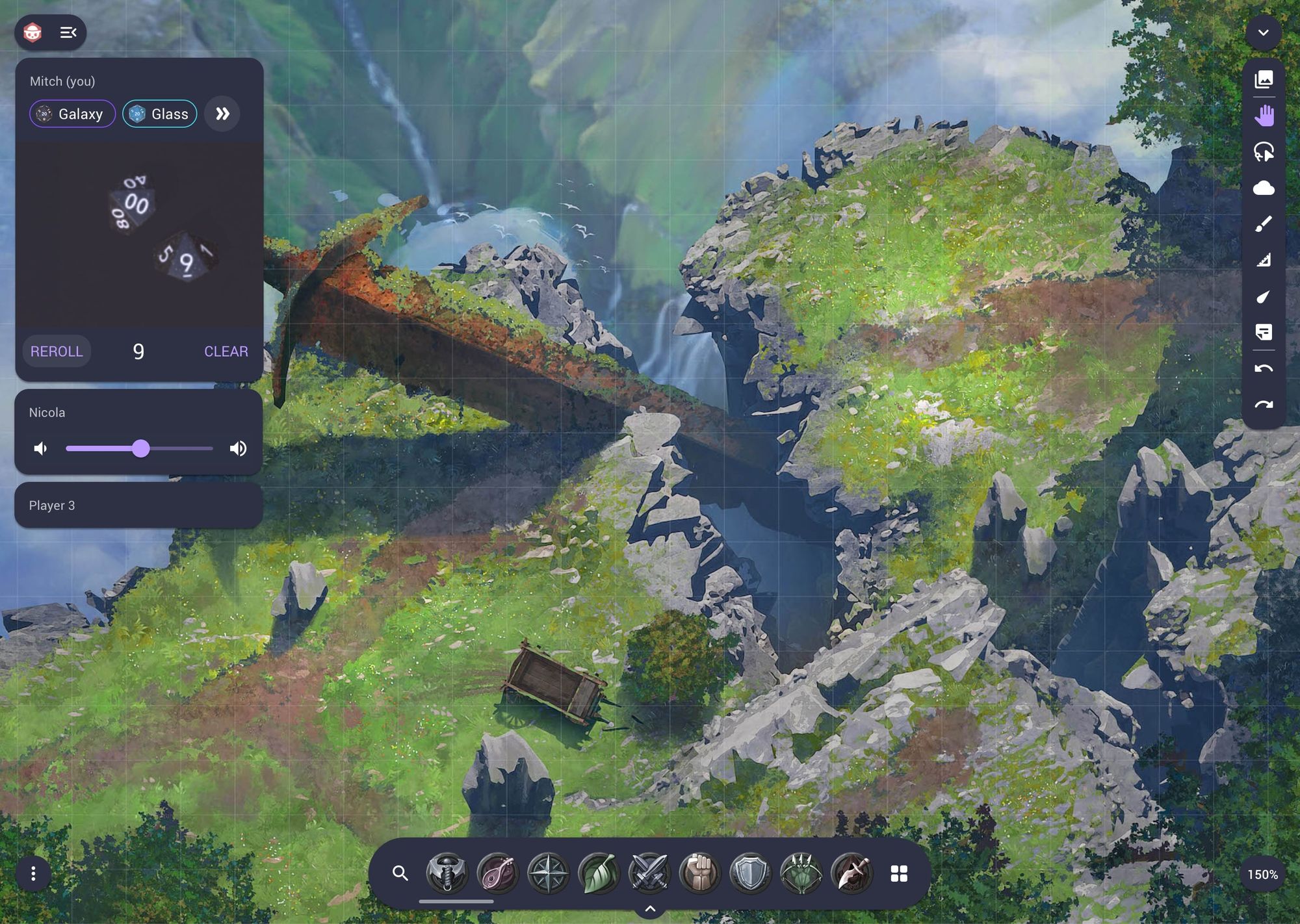
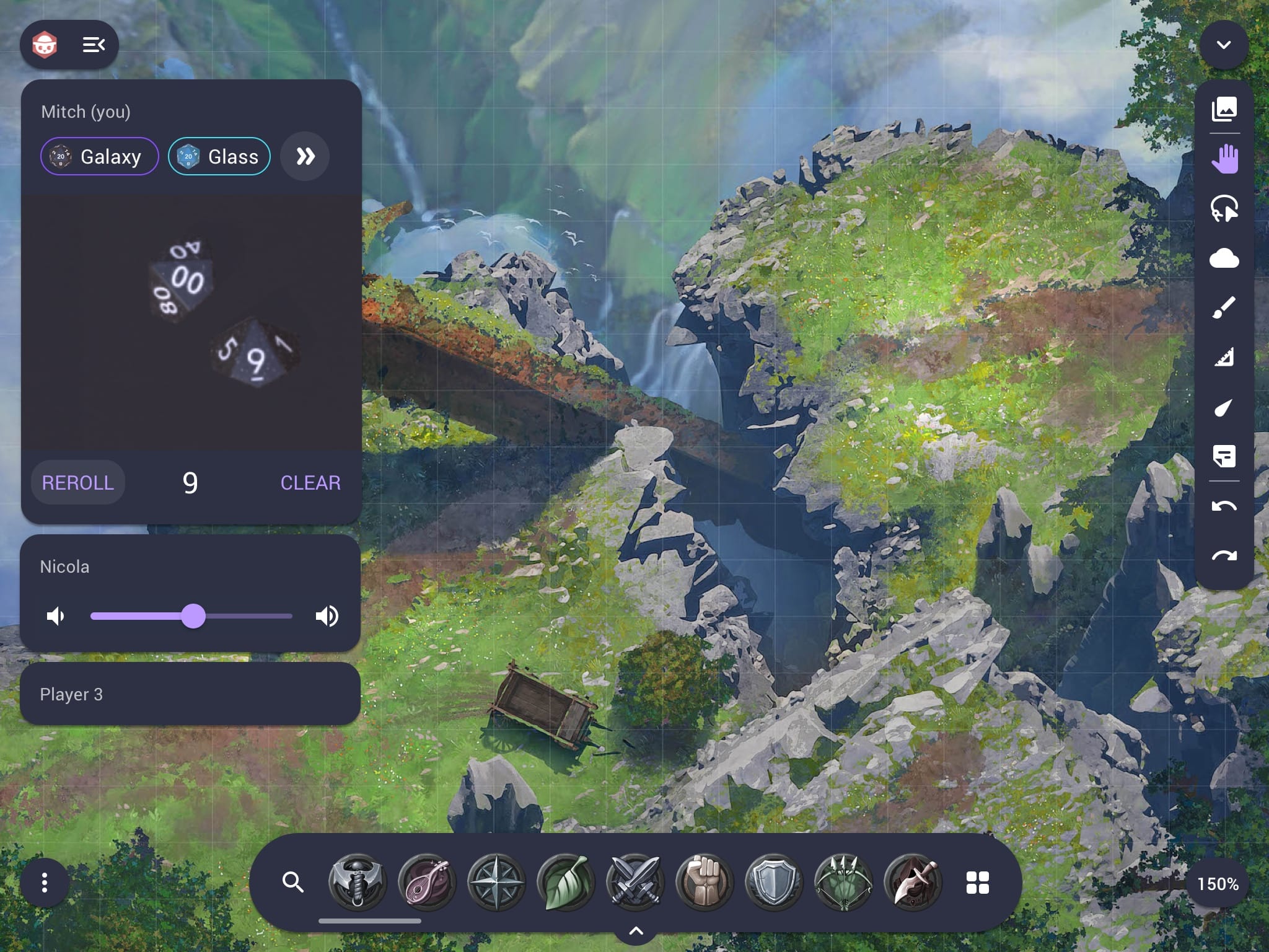
First up is a view of the new main interface on a tablet sized screen.

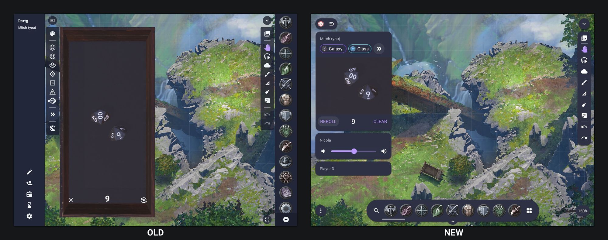
The first big change is the merging of the dice functionality and the party side bar.
This allows us to visually tie dice rolls to a player in a natural way. It also allows us to support multiple dice trays at the same time. To ensure the best display of the dice the view will dynamically adjust to best fit the new size, we hope to show more of this soon.
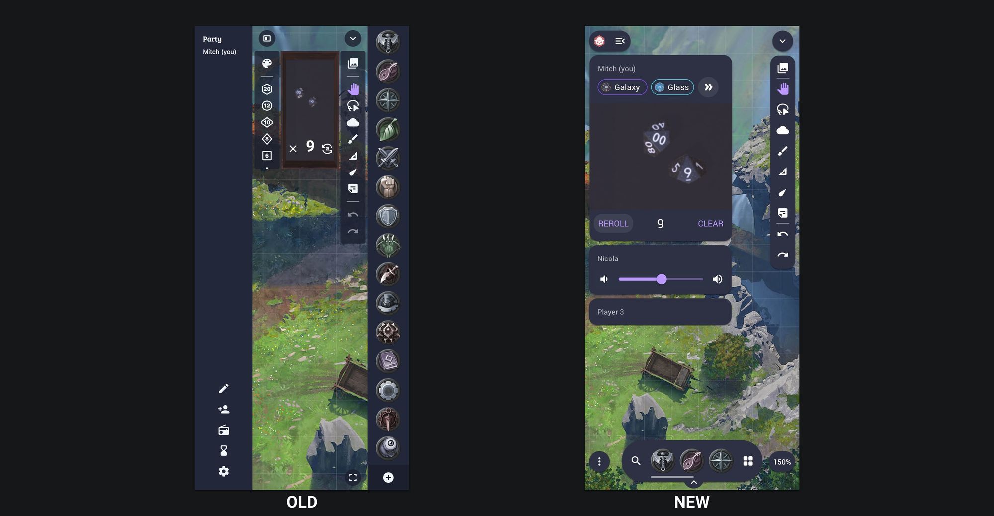
Here's a side by side comparison of the old design and the new design.

The new design is also a lot more compact horizontally which will help the UI scale better on phones.

This change will touch almost every part of the app so there will be a lot more to show in the upcoming weeks and months.
This brings us to the final bit of news and an acknowledgment of the tantalising title of this post.
As we started the journey on these big changes we knew pretty quickly that this was going to take a bit more time than our normal once per month release schedule.
Internally we've started calling these changes Owlbear Rodeo 2.0 to indicate the effort we want to put into it.
It'll be a few months before it's ready but we're hoping to keep up with these more informal posts showing new designs and features.
In the mean time we may release a couple of minor updates to fix any bugs that pop up but new features will most likely be pushed back to make way for this.
Again, thank you all for your continued support.
Credits: the map shown in the mockups is from the great Eightfold Paper
