Owlbear Rodeo 2.0 Beta Patch 11
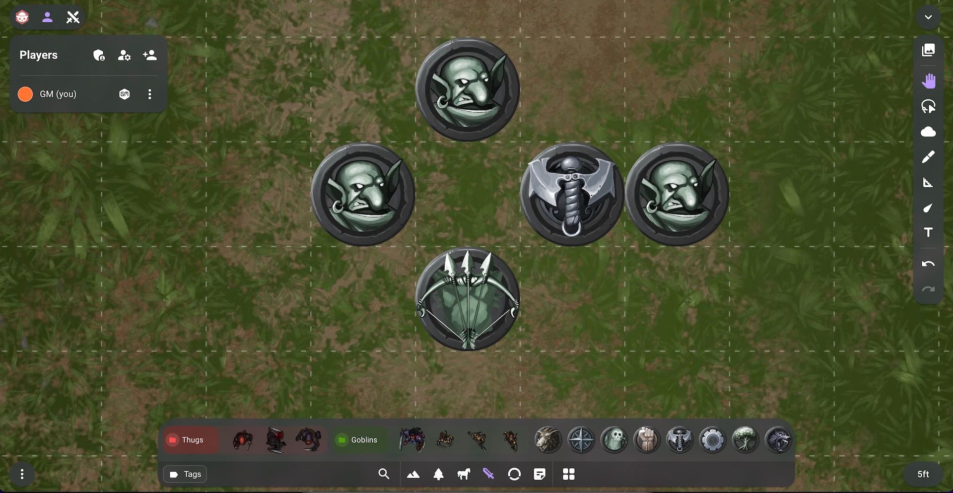
In this release we have a redesigned dock with greater ease of use, better mobile support and more.

Redesigned Dock
In this patch we've redesigned the dock to try and reduce the number of clicks required to get to the images you want.
To accomplish this the dock has been flattened so that the image tabs act as the base layer of interaction.
This means that instead of having a separate hide/show button each dock tab can now control the visibility of the dock.
Making this change means that it is now a single click to access the image tabs, search or image manager when the dock is hidden. In the previous design you would need to show the dock then open the correct tab you wanted, which would take two steps.
With the new dock we've also added keyboard shortcuts for every image tab. This means you can now use the numbers 1-6 on your keyboard to open or close a specific tab. This makes it a lot quicker when you just need one image from your dock and you know where it is.
Tags
Since the first release of 2.0 we've had the concept of favoriting an image. When an image was favorited it would appear in the dock otherwise it would only appear in the image manager.
When you import an image we want it to always be ready in your dock so that means all new images were favorited by default. However, having every image favorited meant that the system didn't really represent your favorite images.
We've also seen reports that it was difficult finding the exact image you needed. Specifically this came up most often when there was an image you knew you'd want to use often (like a spiritual weapon for your cleric) but searching for it every time was a pain.
Theoretically the favorites system would be a solution for this. However, because everything was favorited it didn't really work.
Lastly another issue that has been reported was it was hard to manage multiple campaigns. Mainly because we use a shared image library between all your rooms. We do this because it makes things simpler (you don't need to worry about migrating assets between rooms and it makes having a shared library possible).
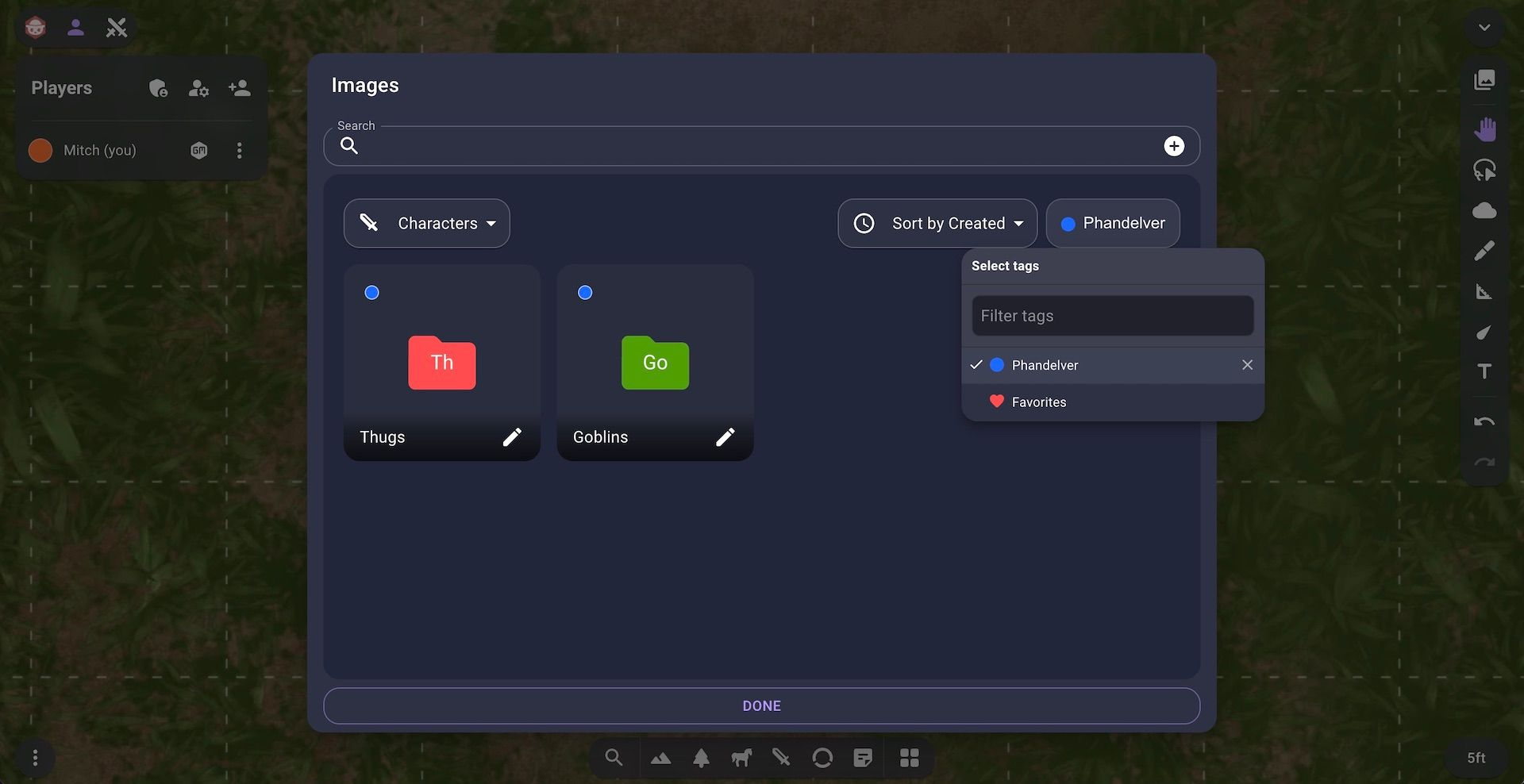
To solve these issues we're introducing a new tags system that allows you to not only favorite images like before but also tag an image with any custom tag that you want.
The tags system shows up in a few places.
First each image can be tagged in the image manager. You can also filter by tags so you can choose to only see your favorites or only see your images tagged as one campaign. Tag filtering works separately in the image manager and the dock so if you want to run different filters for both of them you can.

Search
The new tagging system also factors into a redesigned search experience.
We wanted to solve the issue of not having your most used images when you need them. We think that the new search page will be a great way to do this.
When you now click the search button a list of the most recent images for each tag is shown directly below the search bar.
In the example below we open the search and we've limited our favorites to the images we know we'll need this session. This means we can just grab the one we need without needing to search.
We can see this being useful if you have a druid with wild shape and want to always have access to their forms. Or if you have a set of players that you know are going to be in every encounter you can now always have them accessible.
Better Mobile Experience
The last thing with the new dock is a greatly enhanced mobile experience.
On a mobile device horizontal real-estate is a premium and the previous design meant that you were limited in the number of images you could see at one time.
With this new design we're opting to take up more vertical real-estate on mobile which allows the design to breathe a little more.
Because of the new size on mobile you can fully hide the dock by pressing the hide button or by using the new swipe gesture.
Managing Tags
To start creating tags you can use the new tag picker and click the Create new tag button.
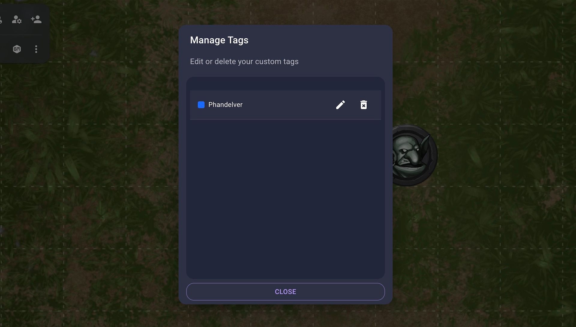
If you're done with a tag or you want to edit the tag once it has been created you can use the new tag manager. The tag manager is available from the extras menu in the bottom left of a room.

What's Next?
Since the announcement of the 2.0 release date we've been getting a lot of feedback from new users. A lot of the updates in this patch come directly from that feedback. We're have always and will always be committed to making Owlbear Rodeo the best product we can. Moving forward through June and into the July release date we still have a lot of polishing to make sure the site is as smooth as possible for launch.
