Owlbear Rodeo 2.0 Beta Patch 12
In this release we have a new asset management system to make tagging and running multiple campaigns easier.

Redesigned Asset Management
In the last patch we released an all new dock that was easier and quicker to use. Alongside this we added the ability to tag your assets. The tagging system was designed to solve two problems. First it should be easier to find common assets that you want to use (like a spiritual weapon for your cleric). Second, it should be easier to run multiple campaigns.
After deploying this change we've been gathering feedback and in this patch hope to make the system a lot easier to understand and use.
Before we get into the changes I'd like to discuss the common approaches to asset management. Generally you can organize assets in two ways. First you can use a hierarchical system. In this system you can create folders and store things in them. But critically in a hierarchical system you can also nest folders inside one another. This is the system that Owlbear Rodeo uses. Each image type (map, character, etc.) is a folder then nested in that the user can create their own folders, which can also have folders inside them, and so on.
The second way to organize assets is to use tags. In this system each asset can be given one or more tags. When the user selects a tag they can see every asset with that tag. Unlike the hierarchical system there's no nesting of tags, instead it is just a flat list of assets.
Probably the biggest system that uses tags to organize things is Gmail.
As mentioned above we wanted the tagging system in Owlbear Rodeo to solve two problems. Make assets easier to find and make it easier to organize multiple campaigns.
Tags are a great way to make things easier to find but when running multiple campaigns we wanted to use a hierarchical system.
Since we wanted the system to solve both these problems we made a hybrid system where the tags would filter the assets but the underlying hierarchy would remain.
Instead of solving both problems well this hybrid system solved both problems poorly. It made it so it was easier to find assets but not as easy as just a tagging system. It also made it possible to organize multiple campaigns but it was harder than just using folders.
So it turns out the solution when you want to use both a hierarchical system and a tagging system together is to just not do it.
So in this patch we've split tags into two parts. Tags are designed to make things easier to find and the new Collections system is designed to make multiple campaigns easier.
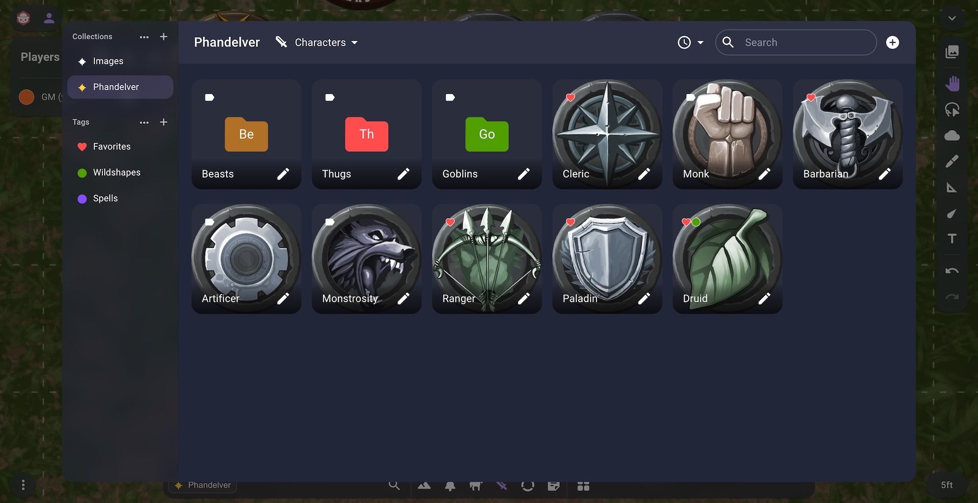
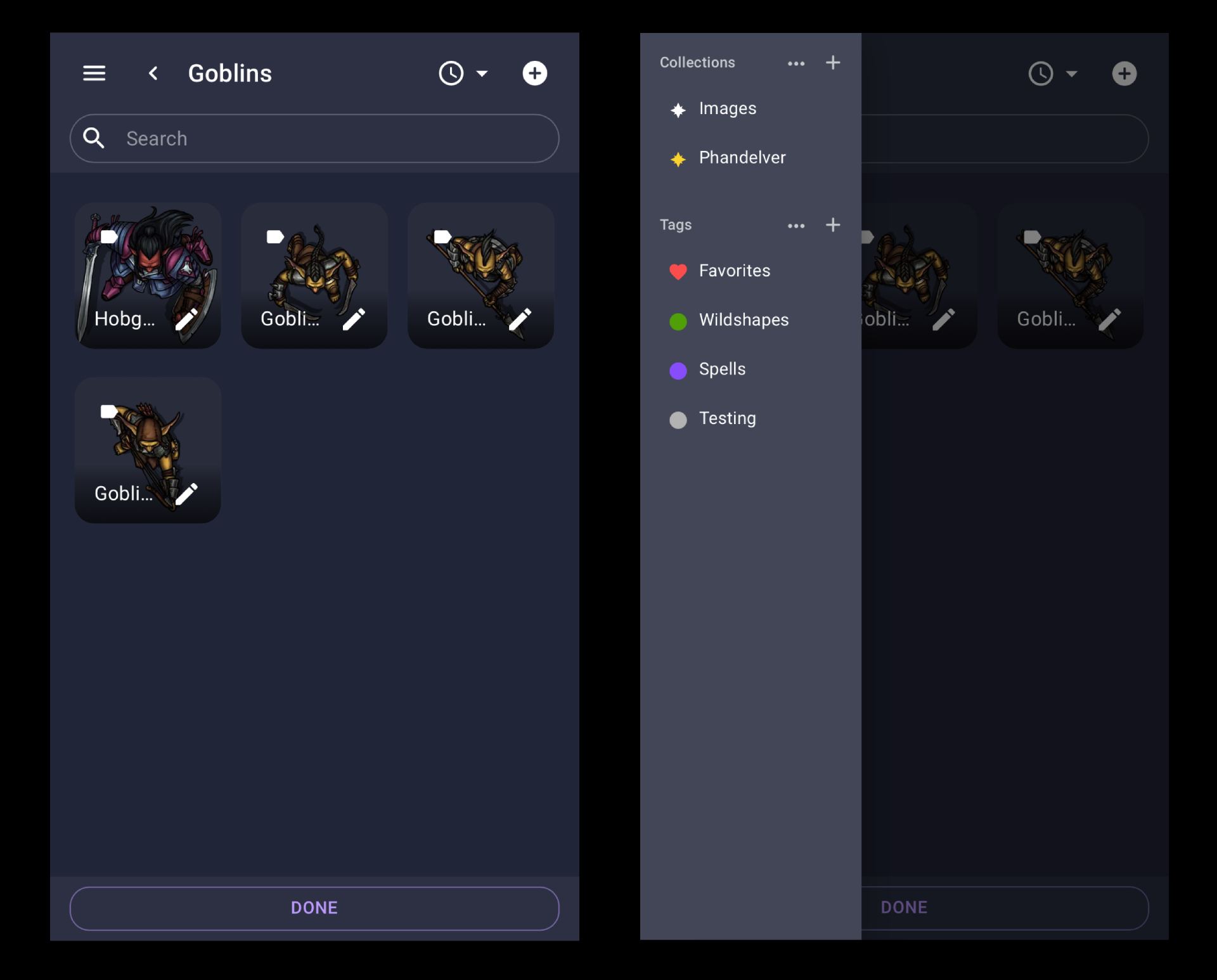
Now when you open the Image or Scene dialog there is a prominent bar on the left side that will show your current collections and tags. On mobile this bar can be accessed via a hamburger menu.

Clicking on a new collection will give you a clean slate where you can organize your images or scenes. When you select a tag you will see every asset with that tag regardless if that asset is in a folder that doesn't share the same tag.
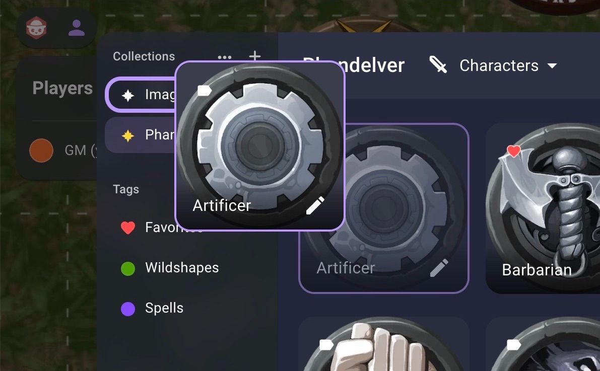
To move between collections you can drag your assets to the collection in the sidebar or use the move to menu available in the bottom right.

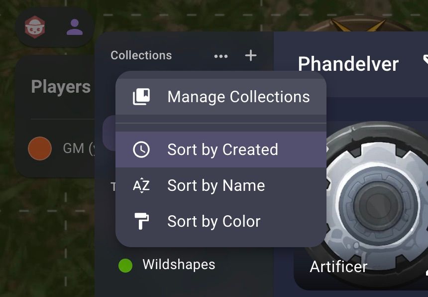
To manage your collections or tags you can click the more button next to the label in the sidebar.

Other Changes
Since the last patch we've made a lot of smaller changes as well that were released throughout the month.
- Selecting locked items has been changed from the shift key to the cmd/ctrl key
- You can now use the cmd/ctrl key to select locked items with the move tool
- The shift key can now be used to extend a selection with the multi-select tool
- The alt key can now be used to shrink a selection with the multi-select tool
- Moved the subscription section to the top of the user profile
- Added functionality to cancel subscriptions at the end of the billing cycle
- Added status to show when subscription is canceled on user profile
- Subscription renewal notices will no longer be sent
- Added the ability to rename an item in the scene by double clicking the name in the context menu.
- Fixed a bug on the server which caused some changes to be saved in the incorrect format
- Added a manage storage button to the storage exceeded error
- Fixed a bug that prevented the folder name from being selected when creating a new folder
- Added tags to the replace image search bar
- Added a Show in Enclosing Folder button when searching for an asset
- Fixed a bug causing assets to load in the wrong order when sorting by name
- Added scroll restoration to the asset manager to make it easier to navigate
What's Next
With the redesigned dock from the last patch and the new asset management system from this patch I think the assets system feels a lot more cohesive. In the remaining weeks until the July 18th launch I plan to continue polishing the interface while adding some of the remaining smaller features. During this time Nicola will continue to be laser focused on optimizing the servers to ensure a smooth experience.
